2026-07-20
10 Office Wall Branding Ideas That Work Harder
Office wall branding ideas that turn blank workplaces into clear brand moments, from logo walls and murals to wayfinding, culture, and client trust daily.
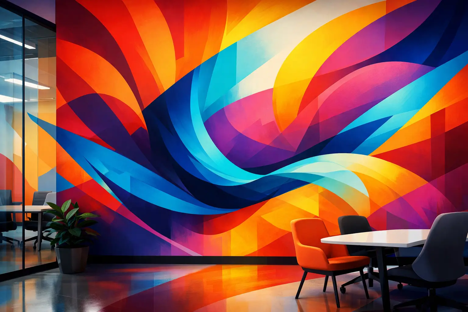
A blank office wall is rarely just a blank office wall. It is often the first surface a client sees, the backdrop for team meetings, or the space employees pass every day without noticing. The right office wall branding ideas turn that overlooked square footage into a clear expression of who your company is, what it values, and why it is different.
Effective office graphics do more than add color. They create recognition, guide movement, support culture, and make a workplace feel intentional. The best approach depends on your brand, floor plan, audience, and how the space is actually used. A boardroom needs a different visual strategy than a reception area or a staff hallway.
1. Build a Logo Wall That Sets the Standard
A logo wall remains one of the strongest choices for a lobby, reception area, or client-facing entrance. It gives visitors an immediate sense of arrival and creates a polished background for photos, meetings, and day-to-day interactions.
The execution matters. A small logo placed too high on a large wall can look tentative, while an oversized mark can overwhelm the room. Consider the viewing distance, the scale of the furniture, available lighting, and whether the wall will appear in video calls. A direct-to-wall printed logo can deliver a clean, integrated finish without the seams, lifting edges, or added depth associated with some decals and dimensional signs.
Use a simple brand color field, a refined neutral background, or a subtle graphic texture behind the mark. The goal is not to decorate around the logo. It is to give it the presence it deserves.
2. Turn Your Brand Story Into a Feature Mural
A mural can communicate more than a mission statement framed in the hallway. It can show the people, places, process, or point of view that gives your organization its identity.
For a Kitchener-Waterloo technology company, that might mean an abstract data-inspired composition that feels intelligent without relying on stock imagery. A local professional service firm may choose a mural that reflects the community it serves. A manufacturer might showcase an elevated visual interpretation of its materials, products, or engineering process.
The strongest story murals are selective. Trying to fit every milestone, service, and value on one wall often creates visual clutter. Choose one central idea, then support it with a few carefully chosen details. High-resolution direct printing allows fine lines, photographic elements, gradients, and large-scale color to retain their impact across an entire wall.
3. Make Company Values Visible in Work Areas
Values belong where decisions are made, not only on a careers page. A well-designed values wall can reinforce the behaviors your organization wants to see in meeting rooms, team spaces, lunch areas, and internal corridors.
Avoid filling the wall with long paragraphs or generic phrases that could belong to any company. Instead, pair a concise value with a clear visual system: custom icons, bold typography, product imagery, or short examples of what that value looks like in practice.
For example, Own the outcome carries more weight when it is paired with a visual style that reflects accountability and momentum. The message should be readable at a glance and still feel considered up close. This is one of the office wall branding ideas that can directly support workplace culture, provided the words on the wall match the reality of the organization.
4. Give Boardrooms a Distinctive Point of View
Boardrooms often default to white walls, generic art, and a logo in the corner. That is safe, but it misses an opportunity. These rooms host client presentations, interviews, planning sessions, and video calls. Their design should reflect the level of thinking and service your business brings to the table.
A boardroom graphic can be restrained and still memorable. Consider a tonal city map, an architectural pattern, an original illustration, a brand-inspired landscape, or a quiet expansion of your visual identity across one feature wall. The design should support focus rather than compete with presentation screens or faces on camera.
If the room has strong natural light, darker colors and high-contrast graphics may work well. In a smaller or lower-light room, lighter artwork with controlled color can maintain openness. Surface preparation and print accuracy are especially important in rooms where clients will sit close to the finished wall.
5. Use Wayfinding as Part of the Brand Experience
Wayfinding does not need to look like an afterthought. Room names, directional cues, floor identifiers, and departmental zones can all carry your brand's visual language.
Direct wall printing is particularly useful for hallways, shared offices, studios, clinics, and larger facilities where people need to move confidently through the space. A simple color band, icon system, or typographic treatment can make navigation easier while making the environment feel more cohesive.
Clarity comes first. Decorative wayfinding that is difficult to read fails its purpose. Use sufficient contrast, consistent placement, and language that visitors understand immediately. Once those basics are in place, brand colors, patterns, and custom graphics can bring the system to life.
6. Create a Culture Wall People Actually Read
A culture wall can introduce team members, celebrate achievements, acknowledge company history, or highlight customer impact. Unlike a formal logo wall, it can be more personal and more frequently updated.
The trade-off is permanence. Direct-to-surface printing creates a refined, durable result, but a wall built around monthly announcements or constantly changing employee photos may be better served by a flexible display area nearby. Reserve permanent wall graphics for stories that will stay relevant: the founding vision, lasting principles, a long-term company timeline, or the people and places that shaped the business.
A strong culture wall is especially valuable in recruiting and onboarding areas. It gives prospective employees and new hires a tangible sense of the organization beyond a slide deck.
7. Bring Product Benefits Off the Screen
For businesses with a physical product, complex service, or specialized process, office walls can make what you do easier to understand. This works well in showrooms, sales areas, customer briefing spaces, and production-adjacent offices.
Instead of covering a wall with dense technical copy, use large visuals and short explanations. Show the product in context. Use labeled details to explain a process. Translate a complicated workflow into a sequence that clients can follow in seconds.
This approach is valuable because it reduces the gap between what your team knows and what a visitor can understand. The wall becomes a useful sales and education tool, not just interior decoration.
8. Define Zones in Open Offices
Open-plan offices can feel efficient but visually anonymous. Branded graphics can define spaces without requiring new walls or major construction.
A feature graphic can signal the transition from reception to work area, identify a collaboration zone, or give a quiet room its own visual identity. Use color and scale deliberately. A wall near active team tables can handle an energetic composition, while focus spaces benefit from calmer patterns and less visual noise.
This is also where direct wall printing has a practical advantage. Large designs can be customized to fit around doors, windows, outlets, furniture, and architectural details instead of forcing the space to fit a standard-size product.
9. Use Local References Without Looking Generic
Local imagery can create an immediate connection to a place, especially for offices that welcome clients from the community. A stylized Grand River scene, an abstracted city grid, or a custom illustration inspired by regional architecture can give a workplace a sense of grounding.
The key is interpretation. Generic skyline photography or familiar landmark images can feel borrowed rather than owned. Custom artwork that draws from local details while using your brand palette will feel more distinctive and more aligned with the rest of the space.
For offices in Waterloo, Kitchener, Cambridge, or Guelph, this can be a thoughtful way to signal local roots without making every wall feel like a tourism poster.
10. Treat the Whole Surface as a Design Opportunity
The most compelling offices rarely rely on one isolated graphic. They establish a hierarchy: a strong arrival moment, a few functional branded touchpoints, and quieter details that maintain continuity through the workplace.
That does not mean every wall needs print. Too much branding can make an office feel busy or overly promotional. Leave visual breathing room. Let key surfaces carry the message, then use color, typography, and materials to connect the rest.
At Inkling Labs, the process begins with the practical details that determine whether a concept will look as good in person as it does on screen: wall condition, lighting, artwork resolution, scale, and finish. Commercial-grade direct-to-surface printing supports detailed output up to 1440 DPI, using low-VOC indoor-safe inks suited to occupied environments.
Before choosing a concept, stand where clients and employees will stand. Look at the wall from the doorway, from across the room, and from a seat at the conference table. The best branded wall does not simply fill space. It makes the space feel unmistakably like yours.